KPI dashboard tools are how marketing and sales teams answer the question leadership asks every Monday morning: what's working, what's not, and where should we focus? A great KPI dashboard doesn't just display numbers — it surfaces the metrics that drive decisions. The wrong tool gives you a wall of charts that looks impressive but tells you nothing you can act on.
For B2B marketing teams the challenge is deeper than for eCommerce: your most important KPIs — cost-per-close, qualified lead rate, pipeline contribution per channel — don't live inside Meta or Google. They live in your CRM. Most KPI dashboard tools pull platform-reported metrics and present them beautifully, but they can't connect ad spend to closed revenue. The tools ranked highest on this list close that gap.
Quick Summary: Best KPI Dashboard Tool in 2026
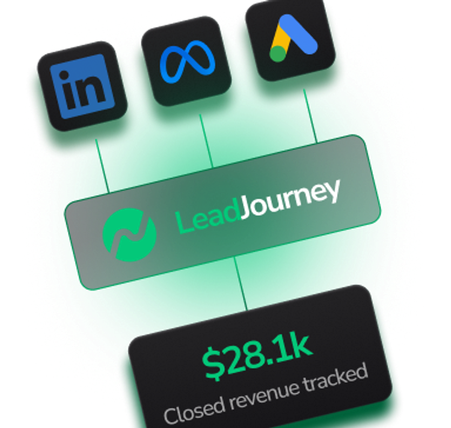
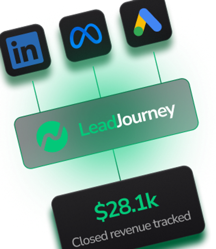
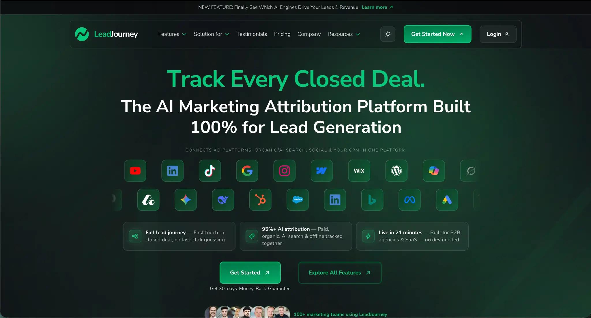
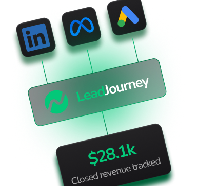
LeadJourney is the best KPI dashboard tool for B2B companies and agencies that need to track the metrics that actually matter: cost-per-close, qualified lead rate, pipeline revenue per campaign, and ROAS based on actual deals — not platform-reported conversions. It connects ad platform data to CRM pipeline stages in real time, giving marketing and leadership a single dashboard that shows the full funnel from first ad click to closed revenue. Server-side tracking at 95%+ accuracy, per-client or per-division workspaces, and automated CAPI closed loop to Meta, Google, LinkedIn, and Bing. Rated 5.0 on Trustpilot, top-rated on G2, Capterra, and Software Advice. 30-day money-back guarantee.
The 15 Best KPI Dashboard Tools in 2026
1. LeadJourney — Best KPI Dashboard for B2B Revenue Metrics
LeadJourney is the only KPI dashboard tool that tracks the metrics B2B companies and agencies actually need to report to leadership: not impressions or CTR, but cost-per-qualified-lead, cost-per-close, pipeline stage conversion rates, and deal revenue per channel and campaign. While other dashboard tools display what ad platforms tell you, LeadJourney connects every marketing touchpoint to your CRM pipeline and presents the full funnel in a single unified view.
For agencies and enterprise teams, the workspace model makes multi-client or multi-division KPI tracking clean: each entity gets its own isolated dashboard environment with its own KPIs, attribution model, and reporting cadence. A central overview lets leadership see performance across all workspaces. And unlike passive dashboard tools, LeadJourney's KPI data actively feeds back to ad platforms — when a deal closes, those signals go to Meta, Google, LinkedIn, and Bing simultaneously, training algorithms to find more buyers like the ones that converted.
Key Features
- Full-funnel KPI dashboard — cost-per-click, cost-per-lead, cost-per-qualified-lead, cost-per-close, and deal revenue per channel, campaign, ad set, and creative
- CRM pipeline KPIs — qualified lead rate, appointment show rate, close rate, and average deal value connected to every marketing source
- Unified multi-channel view — paid (Meta, Google, LinkedIn, Bing), Organic Search, Organic Social, email, AI search engines, and custom channels in one normalized dashboard
- Server-side tracking at 95%+ accuracy — dashboard KPIs based on complete data, not the 40-60% that survives pixel tracking
- Five attribution models — switch between first touch, last touch, linear, time-decay, and position-based to understand each channel's true KPI contribution
- Agency workspace model — separate KPI dashboard per client or division, central overview, per-workspace pricing
- Atlas AI analyst — ask KPI questions in plain language: which campaign has the lowest cost-per-close this month?
- Automated CAPI closed loop — KPI insights activate as conversion signals to all four ad platforms simultaneously
- 21-minute setup — no developer, no BI resources required to get your KPI dashboard running
Pros
- The only KPI dashboard that tracks cost-per-close — all other tools stop at leads or platform-reported conversions
- CRM pipeline KPIs connected to marketing spend — see exactly which channels and campaigns drive qualified leads and closed revenue
- Active dashboard — KPI data feeds back to ad algorithms via CAPI, improving campaign performance automatically
- 95%+ accurate data — dashboard KPIs reflect reality, not platform estimates
- 30-day money-back guarantee
Cons
- Not a general-purpose BI dashboard — purpose-built for marketing attribution KPIs, not financial or operational reporting
- Not built for eCommerce — designed for B2B lead generation and CRM-based sales pipelines
Verdict: LeadJourney is the best KPI dashboard tool for B2B companies, agencies, and enterprise teams that need to report on revenue metrics, not vanity metrics. It's the only dashboard that connects marketing spend to CRM pipeline outcomes and closed revenue — and actively improves campaign performance through CAPI feedback.
What Real Users Say About LeadJourney
"Hands down the best B2B attribution platform for agencies. The Customer Journey Report has completely transformed how we present results to our clients — they love seeing the exact multi-touch path from the first click to the final close." — Max Bogdan, CEO Trustfactory, Trustpilot
"Connected LeadJourney for 2 clients — setup took literally 20 minutes each. The data became more accurate, the reports actually make sense. Now clients look at the dashboard and the 'why don't the numbers match?' questions are gone." — Alexander Samar, Trustpilot
Read verified reviews on Trustpilot, G2, Capterra, Software Advice, and leadjourney.io/testimonials.
The KPI dashboard that tracks
2. Databox — Best for Real-Time Multi-Source KPI Monitoring
Databox is one of the most popular KPI dashboard tools for SMBs and agencies. It connects to 100+ data sources and displays KPIs in real-time with goal tracking, performance alerts, and benchmarking against industry averages. The drag-and-drop dashboard builder makes it accessible for non-technical marketing teams.
Verdict: Excellent for real-time monitoring of platform-reported KPIs across many tools. Displays what your connected sources report — no independent CRM attribution, no cost-per-close, no CAPI loop.
3. Klipfolio — Best for Flexible Custom KPI Dashboards
Klipfolio is a highly flexible KPI dashboard platform that connects to hundreds of data sources and lets teams build fully customized metric views. Strong for agencies and in-house teams that need bespoke KPI layouts tailored to specific client or executive reporting requirements. The formula engine allows custom metric calculations.
Verdict: Best-in-class for custom KPI visualization. Requires manual setup to get value — and like all dashboard aggregators, the insight quality depends entirely on the data sources connected. No built-in attribution or CRM pipeline depth.
4. Looker Studio (Google Data Studio) — Best Free KPI Dashboard
Looker Studio is Google's free reporting and dashboard tool, deeply integrated with Google Analytics, Google Ads, Search Console, and Sheets. The most widely used free KPI dashboard for marketing teams. Highly customizable with community connectors, but requires time to build well-structured dashboards.
Verdict: The right free starting point for Google-centric teams. Strong for Google channel KPIs, weak for LinkedIn, Bing, and CRM revenue attribution. No server-side tracking or CAPI loop.
KPIs that go beyond traffic.
LeadJourney shows the KPIs other dashboards can't: cost-per-close, pipeline revenue per channel, and ROAS based on actual deals.

5. AgencyAnalytics — Best KPI Dashboard for Marketing Agencies
AgencyAnalytics is purpose-built for marketing agencies: white-label client dashboards, 80+ integrations across SEO, PPC, social, and email, automated report delivery, and client portal access. Strong for agencies that need to present multi-channel KPI dashboards to clients on a monthly basis.
Verdict: The go-to for white-label agency KPI reporting. Reports platform-reported metrics — no CRM pipeline depth, no cost-per-close, no CAPI loop to improve client campaigns.
6. DashThis — Best for Fast KPI Report Generation
DashThis focuses on speed: connect your data sources, select your KPIs, and generate a professional client report in minutes. White-label options, automated scheduling, and an intuitive interface make it popular with smaller agencies that need reliable monthly KPI reporting without complex setup.
Verdict: Fast and clean for monthly KPI reporting. Platform-reported metrics only — no revenue attribution, no CRM connection.
7. Power BI (Microsoft) — Best Enterprise KPI Dashboard for Microsoft Stacks
Power BI is Microsoft's enterprise BI and KPI dashboard platform, deeply integrated with Azure, Excel, Dynamics CRM, and LinkedIn Ads. Highly customizable with DAX formulas and hundreds of connectors. The standard for enterprise teams standardized on Microsoft infrastructure that need KPI dashboards across marketing, sales, finance, and operations in one environment.
Verdict: Best-in-class enterprise BI dashboard for Microsoft-native organizations. Requires data engineering to build marketing attribution models on top of raw data. No built-in server-side tracking or CAPI activation.
8. Tableau — Best for Advanced Marketing Data Visualization
Tableau is one of the most powerful data visualization platforms for enterprise KPI dashboards. It handles complex data models, advanced calculations, and interactive visualizations at scale. Popular with large enterprise analytics teams that need to present sophisticated marketing performance KPIs to executive stakeholders.
Verdict: Best-in-class for advanced KPI visualization and storytelling. Requires a data analyst to maintain. Visualizes data from connected sources — attribution quality depends on the underlying data model, not Tableau itself.
The only KPI dashboard
LeadJourney is the only KPI dashboard tool that connects ad spend to CRM closed revenue — no BI team needed, 21-minute setup.
9. HubSpot Reporting — Best KPI Dashboard for HubSpot Ecosystems
HubSpot's built-in reporting connects marketing, sales, and service KPIs within its own ecosystem. For teams running their full funnel inside HubSpot — ads, landing pages, email, CRM, and sales — it delivers a coherent KPI view across the customer lifecycle. Strong for contact-level attribution within the HubSpot stack.
Verdict: Excellent in-ecosystem KPI reporting for full HubSpot users. Limited for teams running significant paid campaigns outside HubSpot or needing cross-platform attribution across Meta, LinkedIn, and Bing.
10. Whatagraph — Best for Visual Cross-Channel KPI Reports
Whatagraph is built for producing visually polished cross-channel KPI reports for clients. Connects to 40+ data sources with a drag-and-drop report builder, automated delivery, and white-label branding. Popular with agencies that prioritize presentation quality in their client KPI reporting.
Verdict: Strong for visually impressive cross-channel KPI summaries. Platform-reported metrics only — no CRM revenue attribution, no cost-per-close KPI.
11. Supermetrics — Best Data Layer for Custom KPI Dashboards
Supermetrics feeds raw platform data into Looker Studio, Google Sheets, or BI tools where teams build their KPI dashboards. The de facto standard for populating custom marketing dashboards with multi-platform data. Not a dashboard tool itself — it's the data layer that makes custom dashboards possible.
Verdict: Essential for teams building custom KPI dashboards in Looker Studio or Google Sheets. Moves platform-reported data — attribution intelligence must be added on top by the team.
12. Geckoboard — Best for Live KPI Wallboards and TV Dashboards
Geckoboard specializes in live KPI wallboards designed to display on office TVs and screens. Simple to set up, connects to 80+ sources, and displays real-time KPIs in a format optimized for large screens. Popular with sales and marketing teams that want always-visible KPI tracking across the office.
Verdict: Best for office KPI wallboards. Displays platform-reported metrics in real time — no attribution depth, no CRM integration, no revenue KPIs.
13. Looker (Google Cloud) — Best Enterprise KPI Dashboard on Warehouse Data
Looker (the enterprise platform, distinct from Looker Studio) models data in cloud warehouses with LookML and delivers sophisticated KPI dashboards and embedded analytics. Used by large enterprises that need consistent KPI definitions across business units and self-service analytics for non-technical stakeholders.
Verdict: Best-in-class enterprise KPI modeling on warehouse data. The quality of marketing KPIs depends on the attribution logic built into the underlying data model. Requires data engineering to set up and maintain.
14. Cometly — Best for Paid-Channel Attribution KPIs
Cometly provides server-side attribution with AI optimization recommendations for paid channels. Goes deeper than standard dashboard tools by offering actual attribution KPIs for paid campaigns rather than just platform-reported numbers. Limited to paid channels without organic, AI search, or CRM pipeline depth.
Verdict: A step up from standard dashboards for paid attribution KPIs. Missing organic channel coverage and the CRM pipeline depth needed to track cost-per-close.
15. Ruler Analytics — Best KPI Dashboard for Call-Driven Businesses
Ruler Analytics tracks inbound calls back to their marketing source and matches lead source data to CRM revenue. For businesses where phone calls are the primary conversion event, it provides KPIs that most tools miss entirely: which campaigns generate calls that close. Strong niche tool for phone-first B2B businesses.
Verdict: The right KPI dashboard for phone-call-centric businesses. Does not offer a CAPI closed loop or unified multi-channel attribution across paid and organic.
The KPI That Separates Good Dashboards from Great Ones
Most marketing KPI dashboards answer the same questions: how many impressions, clicks, and leads did we generate? These are useful operational metrics — but they're not what drives strategic decisions. The KPI that drives budget allocation, agency retention, and executive confidence is cost-per-close: how much did it cost to acquire a paying customer, broken down by channel, campaign, and creative?
Only one tool on this list tracks that KPI out of the box for B2B companies: LeadJourney. It connects every marketing touchpoint to the CRM pipeline stage it produced — qualified lead, appointment, close — and reports cost-per-close per channel, campaign, ad set, and creative in real time. No SQL, no data engineering, no BI team required.
The second differentiator: what happens to those KPI insights after they're displayed. Passive dashboards stop at the screen. LeadJourney's KPI data automatically feeds back to Meta, Google, LinkedIn, and Bing as conversion signals — so the campaigns with the best cost-per-close KPIs get more budget directed toward similar audiences by the algorithms themselves.
Frequently Asked Questions
What is the best KPI dashboard tool for B2B marketing in 2026?
LeadJourney is the best KPI dashboard tool for B2B marketing teams. It tracks cost-per-close, pipeline revenue per channel, and ROAS based on actual deals — not platform-reported conversions. For agencies needing white-label client dashboards across many marketing tools, AgencyAnalytics and Whatagraph are strong alternatives. For enterprise BI, Power BI and Tableau offer maximum flexibility with the right data engineering investment.
What KPIs should a B2B marketing dashboard track?
The most important B2B marketing KPIs are cost-per-qualified-lead, cost-per-close, close rate by channel, pipeline contribution per campaign, and ROAS based on closed revenue. Most dashboard tools only track top-of-funnel KPIs like impressions, clicks, and cost-per-lead. LeadJourney tracks the full funnel by connecting marketing touchpoints to CRM pipeline stages and deal values.
Can LeadJourney replace our existing KPI dashboard tool?
For marketing attribution KPIs, yes. LeadJourney provides a unified attribution dashboard covering all paid and organic channels with CRM pipeline depth. For teams that also need operational, financial, or cross-department KPI dashboards, tools like Power BI or Tableau remain valuable — LeadJourney can run alongside as the dedicated marketing attribution layer.
Why do most KPI dashboard tools not show cost-per-close?
Because most KPI dashboard tools are data aggregators: they display what ad platforms report. Ad platforms only know about clicks and form fills — they don't know whether that lead eventually closed. To track cost-per-close, you need a tool that connects marketing touchpoints to CRM pipeline data. LeadJourney does this by capturing click IDs server-side and matching them to CRM deal outcomes as they progress through the pipeline.
Further Reading
Explore the LeadJourney marketing attribution platform or compare the best marketing agency reporting tools, best marketing dashboard tools, and best B2B attribution software. LeadJourney was founded by Jonas Strambach, a performance marketing expert and agency founder.
Ready to track KPIs that matter?
KPIs you get out of the box:
- Cost-per-click, cost-per-lead, cost-per-qualified-lead
- Cost-per-close and deal revenue per campaign
- Close rate and pipeline stage conversion by channel
- ROAS based on actual closed revenue
- All channels: paid, organic, AI search, custom
- CAPI loop to Meta, Google, LinkedIn & Bing